The colors to use in 2022: Discover the list here!
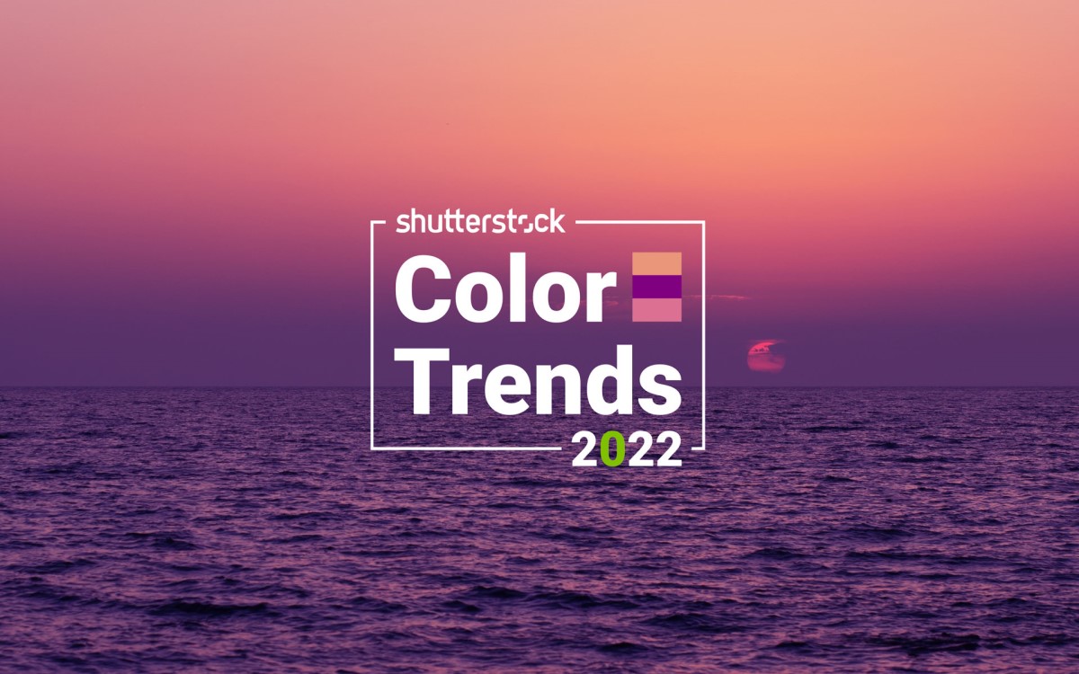
Like every year, Shutterstock is taking advantage of the most colorful time of the year, autumn, to publish its Color Trends 2022 report. Analysts and design experts from the image bank relied on “ millions of images uploaded worldwide, where every pixel nuance is counted, as well as recent click-through rate (CTR) performance to reveal the colors to watch for 2022. This year’s report also includes data from the Shutterstock.AI initiative, which helps decipher how a specific color performs in digital media.
Contents
More serene colors for 2022
Data and pixel analysis shows that serenity should be in the spotlight among design professionals.
Calming Coral
This soft pastel color with a peach tone can be mixed with other predominantly yellow and pink colors to bring a nostalgic tint to your creation. This palette can be complemented with sky blue to reinforce an even more natural and comforting feeling. The colour Calming Coral can be used in particular to highlight a message of warmth, comfort and peace.
Its color code: #E9967A
Purple Velvet
Unlike other more expressive shades of purple, this Purple Velvet is resolutely softer, while retaining in its DNA the royal references to which it appeals. The one who is considered as our boldest trend color for 2022 goes very well with a contrasting shade of green, like emerald. You can also use it to bring an accent ” flashy neon-electric type to your campaigns.
Its color code: #800080
Pacific Pink
This subtle hue is among the colors set to mark the year 2022, according to Shutterstock’s report. You can pair it with pink and peach tones, while recalling ” the images of a wilted flower pressed between the pages of an old book “. It is ideal for composing a sunset landscape on a sparkling beach in the Pacific or elsewhere.
Its color code: #DB7093
Shades of green to improve performance
According to data reported by Shutterstock.AI, shades of green have dominated click-through rates and conversions in ad campaigns this year. To increase the effectiveness of your next creations, it is recommended to integrate a touch of emerald, jade, lime or even mint into your creative projects.
The green color palette to inspire your next creations:
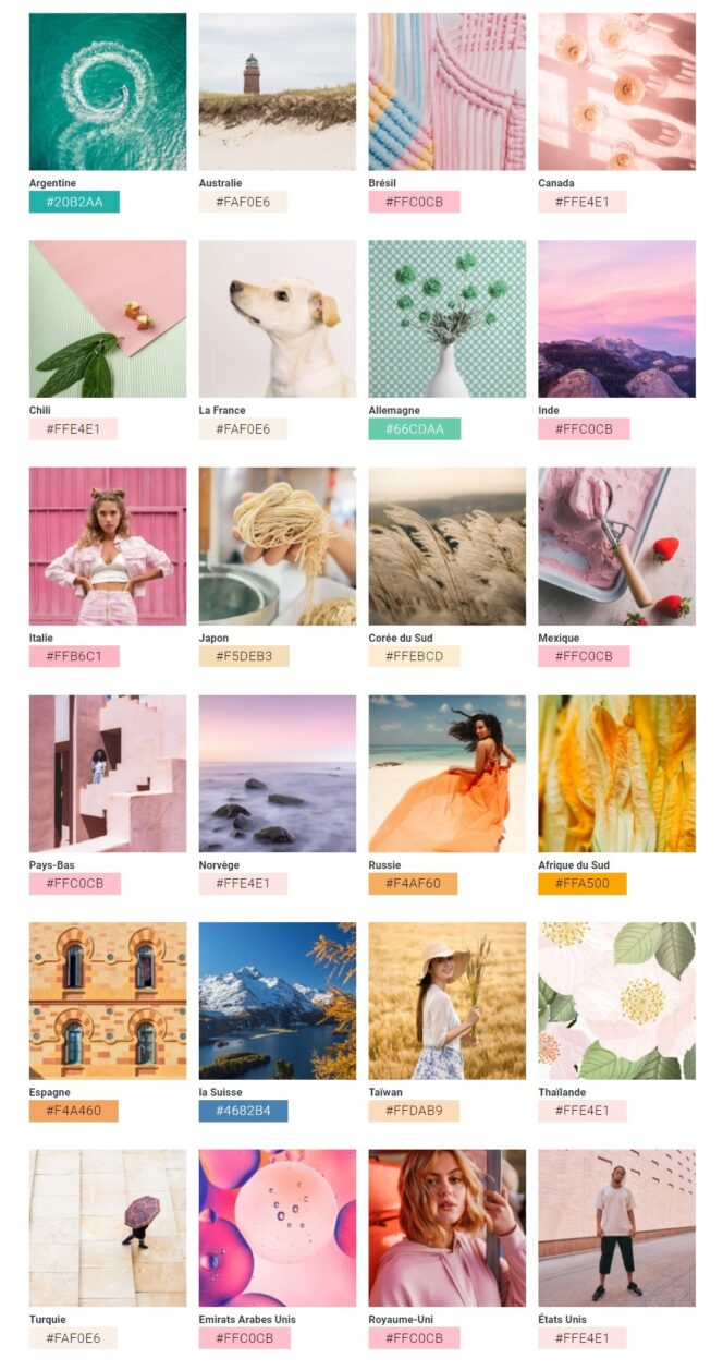
The most popular colors by country
The report studied more than 20 countries to derive figures for the most popular colors used in each of these regions, to obtain an overall view of the most fashionable colors in the world.