Psych Out design is funky, bold, and trending now
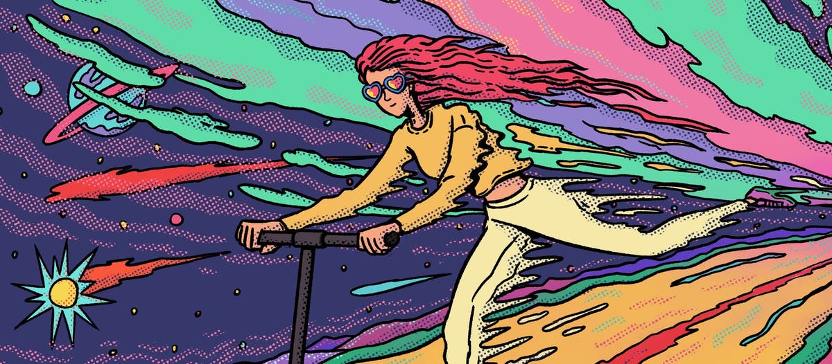
Image source: Adobe Stock/Goce Ilievski/Stocksy.
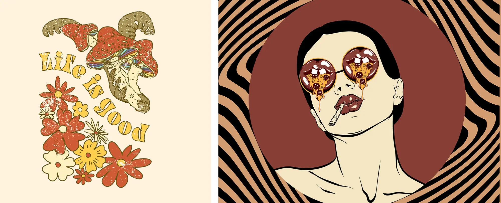
Everyone associates psychedelia with the counterculture movement of the late 1960s and on into the 1970s, ornamented with intense patterns, wildly colorful palettes, and a variety of surreal and eye-catching text treatments. Recently, graphic designers and brand campaigns are re-imagining the wild styles of the 70s with a sense of balance and restraint, giving us a design trend that is both nostalgic and contemporary. One of the annual Creative Trends from Adobe Stock, we’re calling this explosion of bold design Psych Out.
Contents
Psychedelic design, from roots radicals…
1967 was the Summer of Love, when tens of thousands of people gathered in San Francisco for a rolling celebration of music, sexual liberation, drugs, and political activism with a style all its own. Headliners included Jefferson Airplane, The Grateful Dead, and Jimi Hendrix, and all popularized standout examples of psychedelic art on their best-selling records like, After Bathing at Baxter’s, Jefferson Airplane (1967) — Axis: Bold As Love, The Jimi Hendrix Experience (1967) — and Aoxomoxoa, (1969) by the Grateful Dead.
Rising superstar Janis Joplin paired up with artist R. Crumb to create a Big Brother and the Holding Company album cover for Cheap Thrills (1968) that capitalized on the convergence of the San Francisco concert culture and a burgeoning indie comics scene centered around the Haight-Ashbury neighborhood.
Even far more mainstream pop bands like the Beatles took a psychedelic turn during this era, presenting Revolver (1966), Magical Mystery Tour (1967), and Sgt. Pepper’s Lonely Heart’s Club Band (1967), all of which cultivated an increasingly psychedelic sound and look for the formerly clean-cut foursome.
Image source: Left: Adobe Stock/NTKN, Right: Adobe Stock/varvarabasheva.
Early psychedelia owes much of its aesthetic to drug culture, with use of hallucinogenic substances finding their way into the mainstream. Though lysergic acid diethylamide (LSD) was discovered in the late 1930s, it found its champion in psychologist and writer Timothy Leary, who researched psychedelic drugs heavily in the late 50s and early 60s and became an outspoken advocate for their use. Acid and hallucinogenic mushrooms were routine party drugs around the 1960s-70s, and the visual hallucinations they triggered translated directly into some of psychedelia’s signature motifs: vivid colors, repeating geometric or flowing patterns, and melting text and images.
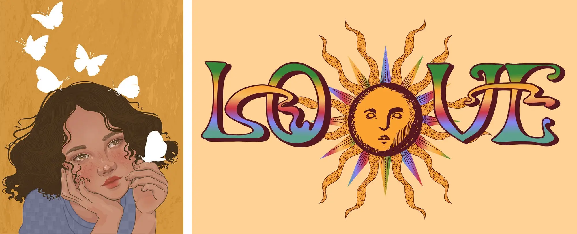
The psychedelic look also owes a debt to art nouveau, with many artists and designers of the 1970s incorporating and reimagining the detailed ornamentation, flowing lines, feminine figures, and maximalist themes that were a hallmark of turn-of-the-century art and design from 1890 to 1910. The poster art that made concert venues like the Fillmore and the Avalon landmark destinations for Summer of Love acts is an echo of the decorative art and architecture that flourished in Europe at the end of the previous century.
These aesthetics share much in common, with “free love” of the 1960s updating the Romanticism of the art nouveau era — an aura of 70s self-seeking updating the turn-of-the-19th-century Spiritualist movement — and both featuring floral motifs, as well as skulls, birds, and voluptuous women with long, flowing hair.
Image source: Left: Adobe Stock/slovoslave, Right: Adobe Stock/Shamanska Kate.
…to throwback chic
Though psychedelia’s origins are a bit gritty, there’s no need to freak out, man. The 70s are a major midcentury aesthetic milestone, marking many social and visual changes. Today, brands are ready to get into that same groove with some sophisticated design updates.
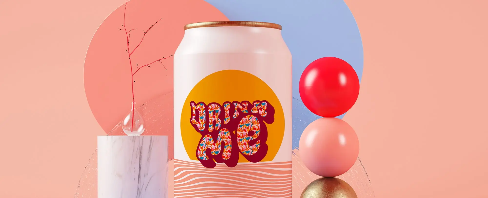
Bold hand lettered type treatments are much easier to deploy as fonts like Cheee and Synthemesc — choices like Whomp and Opake offer impact with a cleaner feel — and HWT Arabesque captures art nouveau through the looking glass. These funky fonts offer opportunities to engage consumers and incorporate type as an integrated illustrative component of graphic design.
Image source: Mockup: Adobe Stock/McLittle Stock, Graphic: Adobe Stock/Mira Kunstler, Text effect: Adobe Stock/Wavebreak Media, Font: Adobe Fonts/Typodermic.
Likewise, contemporary takes on the genre are limiting the cacophony of clashing colors, opting for an elegant array of jewel tones that afford eye-catching, high-contrast compositions without triggering an acid flashback. Sea-foamy greens, olive notes, and peacock blues dance with oranges, corals, and magentas, shading into regal purples for a rich and well-rounded palette.
Compared with previous takes on psychedelic design, this year’s version is chromatically subtler. “The color palette is part of what makes it a little bit more restrained,” says Shea Molloy, vectors and illustrations lead at Adobe Stock. “You’ll see palettes that include many variations of similar colors, but not necessarily the whole rainbow — or if you do, it might be a subdued, dark rainbow. You’ll also see very warm, Earth-toned color palettes with this trend.”
Ultimately, as observed in January’s design trend announcement, Psych Out is the right treatment for moments that wish to capture the transition from unchecked lightness and optimism into a heavier reality. Just as psychedelia accompanied the idealism of the late 1960s as it came to reckon with broader issues of social injustice, war protest, and the sometimes-tragic consequences of a never-ending party, it can inject energy into brand values that seek to address weighty challenges like climate change, and social challenges like re-emergence into a landscape shaped by a long period of isolation.
Where it’s at: Psychedelic design for brands and beyond
While psychedelic aesthetics were once the purview of head shops and wheat-pasted concert promos, designers are now broadcasting good vibes across several frequencies. Food and beverage brands, in particular, seem to embrace this trend.
“We’re seeing a lot of product designers releasing their own products and using Psych Out branding while signaling that the items are locally-made, hand-crafted, or environmentally friendly,” says Molloy.
A few recent examples from the beverage and retail sectors:
Brazil had its own love affair with the previous era of psychedelic art, and contemporary Brazilian artist Henri Campeã ably demonstrates the power of Psych Out design to package coffee, beer, or to grace the cover of the Washington Post weekender.
Alpha Box & Dice presented a whole line of Tarot-inspired wine branding in a juicy palette of emeralds, corals, purples, and goldenrods, with imagery that could have been straight out of La Planète sauvage (Fantastic Planet), a 1973 animated film about a strange world with giant aliens where humans are kept as pets.
Fahrenheit 32 deploys Psych Out style on sweatshirts, logos, retail materials, and for package design on coffee and supplements. The winding flow of typeset in the branding style seems to lend itself especially to beverage design.
The hand-drawn qualities of psychedelia also make it a natural showcase for illustrators. A contemporary psychedelic retake on the Rider-Waite tarot deck by illustrator Dawn Aquarius is in its 10th printing. The original Rider-Waite debuted in 1909, and its art nouveau styling and Spiritualist roots are fertile ground for inspiration in psychedelia. Riso print concert posters for drag queens Trixie Mattel and Juno Birch by Canadian designer Cristian Fowlie show the potential to tap into the rich history of psychedelic poster art for contemporary subjects. Artist Morgan McPeak uses eye-melting psychedelia to deliver messages on subjects ranging from social change to personal affirmation.
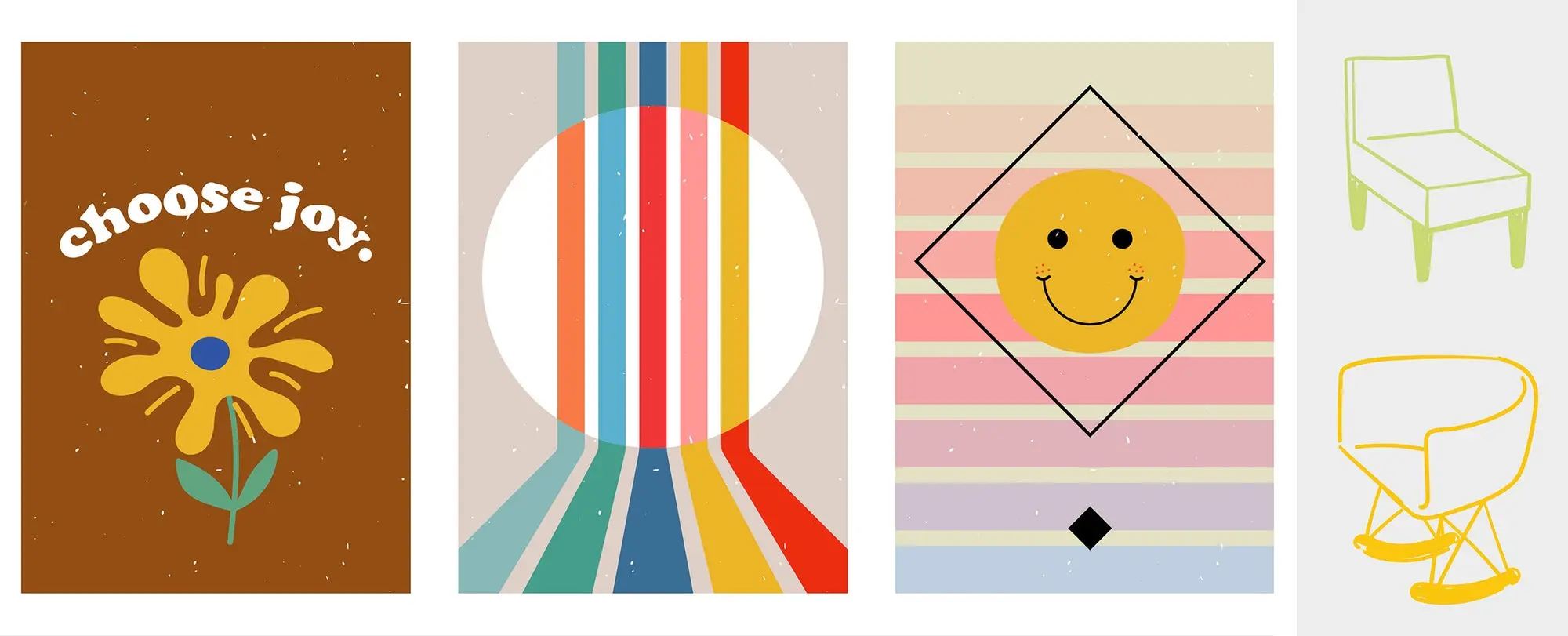
Psych Out branding is an ideal fit for introspective neo-spiritualism, from poster art, stickers, and energy work — but it also has many functional applications, and is even enjoying a revival among institutions famous for their minimalist leanings, like IKEA and Cooper Hewitt.
Image source: Left: Adobe Stock/Nataly, Right: Adobe Stock/Nataly.
Tune In, trend on, Psych Out
Funky, escapist, and bold, the Psych Out design trend is a fresh take on well-known nostalgic elements — and still full of surprises. Check out the Psych Out collection on Adobe Stock.
Creators wanted: Inspired by the psychedelic design revival? We want to hear from you. Become an Adobe Stock Contributor, then upload and start selling your most far-out designs. Get more ideas with the Psych Out Call For Content from Adobe Stock.
Source : Adobe

