Modernizing horse racing with a Webby award-winning website: DeepSleep and 1st.com
DeepSleep Studio is our multidisciplinary Branding & PR studio – we’re a tight knit group of creatives that love nothing more than tackling a challenge and working closely with our clients to create engaging experiences. We recently got the chance to do that in an exciting new way, working with entertainment and real estate development company Stronach Group to propel the sport of thoroughbred horse racing into the modern-day. “Race-day culture” certainly had its heyday, flourishing until mid-1900, as a popular sport infused with passion and patronage. Today, many consider the sport passé – not appealing to newer crowds. It was time to change the face of the sport and grant it a new, more youthful look.
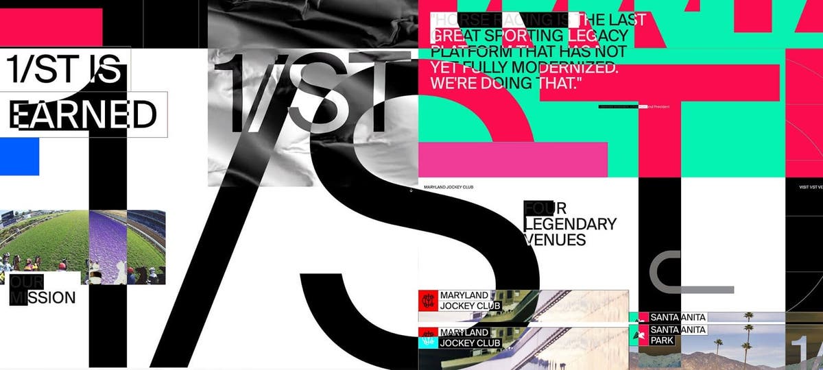
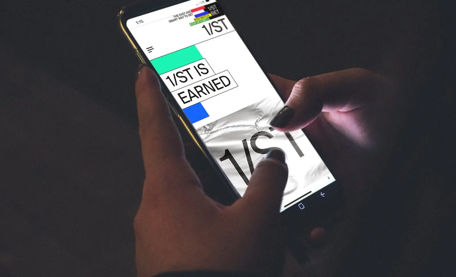
The task of creating this new look took us to incredible places – we stepped away from our computers and headed to racetracks and horse barns, ultimately designing and developing the group’s consumer-facing website 1st.com to highlight their new image and dialogue. The site went on to win a Webby Award as one of the top general sports websites of 2020, beating creative powerhouses such as Google Creative Lab and ESPN – a solid indicator that our plan is working.
One of the biggest challenges, when we took on this project, was that we were entering a world that we knew very little about. It was a big learning experience for the first few months, and we had to get up to speed. 1/ST, which is the name the Stronach Group is doing business as, is one of North America’s leading thoroughbred racetrack operators, and they flew us out to every racetrack they own. We were taken backstage, went through the stables, and talked to the caregivers. This helped us become embedded into the DNA of 1/ST and understand all the terminology and the nuts and bolts of what goes on in the background.
The next step was to carry out an audit of 1/ST’s content to figure out how we could centralize it and make it as easy as possible for people to understand what it’s all about. We were given everything we needed to establish the website layout, and even though it was a very collaborative process, we were pretty much given free rein. Let me take you deeper behind the scenes of the project, and how we used Adobe XD to ultimately create this award-winning design.
Contents
Developing a new visual identity for a traditional sport
A lot of the branding was based on the design of the jockey silks, and we designed this web experience with the same thing in mind. Whatever sport you design experiences for, look at the details. So many of my notes came from a conversation with a caretaker who made sure that all the silks were in pristine condition. He knew every story behind every jockey – it was beautiful. He brought down some vintage silks that hadn’t been seen by people in years, and it really helped us embrace the shapes, patterns, and colors of the garments. Try to get to the core of what their players are wearing, that’s usually where the magic lies.
Video and big, beautiful imagery were also central to making a connection with the customers. It really needed to hit them while they were scrolling through the site. Our approach to shooting video is very cinematic and based on storytelling. We captured obscure moments and instead of showing an entire horse, for example, just cropped into the eye or ear with a lot of negative space. Taking a more artistic approach to filming the sport helped us develop the brand. The videos needed to be forward-thinking to really tell 1/ST’s story.
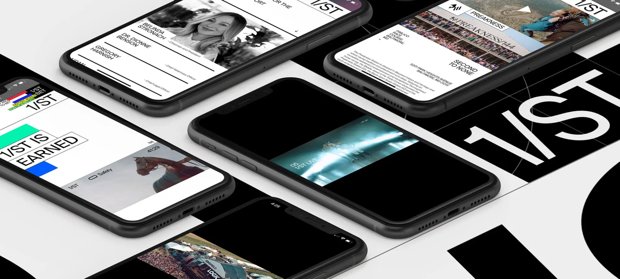
We were also careful to curate content that could both grab and grip mobile users, as the ability to hold attention on mobile was critical to tapping into the younger demographic that would push 1/ST into the future.
Lastly, we took a lot of inspiration from Swedish design. I recently took a trip to Sweden to work on another client project, and I was mesmerized by the design. I found myself snapping photos and taking notes of aspects that I wanted to apply. That trip changed my whole thinking about how we approach design. Bringing a bit of Swedish simplicity into the UI was very important.
A fluid workflow made possible by Adobe XD
To create this web experience for 1/ST, we chose Adobe XD because it’s so fluid. We were able to create a lot of artboards and just drop in a 50MP photograph without any lag. When you’re working as fast as we do, it helps to be able to put things together and rapidly prototype to ensure that all the pages jive with one another. It’s a lot like creating a sculpture – you’re working on an individual piece and making sure that the information is being processed right, but then you need to zoom out and look at everything together.
To create this web experience for 1/ST, we chose Adobe XD because it’s so fluid.
A project like this, back in the day, would have taken three days to complete — now we can do it in just one day, and this boosts our productivity tremendously. We’re also even using XD for design presentations because it allows us to embed content and provide a much more immersive experience of what the website is going to look and feel like.
A Webby Award, and a big win for small-but-mighty agency
1st.com was actually nominated for two Webbies, best website navigation structure and best general sports website, and we need to thank Adobe XD for doing its part to help. When we found out that we had won the sports category, we were floored — I told everyone during our daily morning huddle on Zoom, and they all started clapping. A big corporation like 1/ST put their trust in a smaller agency, like us, and it paid off. It was humbling to see our work compete against groups that we respect so greatly. I think the key to our success in this project lies first-and-foremost in the flow of the information — the website clearly communicates what 1/ST is about in a very visually appealing way.
When we get big wins, like the Webby for 1/ST’s website, it reminds me that there are a lot of benefits to being a smaller agency. The big ones rely on power and numbers — they come to client meetings with 25 people, but sometimes the client doesn’t want that. Sometimes, clients (even big ones) come to you because they know you’ve got the expertise and the team to pull it off, and that you’re the right fit for their model of working and communicating. Our clients communicate with a maximum of two or three people. We really get to know the client from the beginning to understand the end game and build trust, then we find the creative path to get them there and always hit our deadlines — that’s very important. Reputation in this industry is everything.
DeepSleep’s background is in nightlife branding. Back in the day, we were designing flyers for every major nightclub in Las Vegas, Miami, and New York. In that industry, you’re only as good as your last design, so you have to think really fast and always be ahead of the trends. We carry that discipline through to today. DeepSleep has been around for more than 15 years but we still approach design with the hunger of always wanting to do better than on the last project. Boosted by the Webby win, the client has now asked us to build out websites for every racetrack 1/ST owns, and that feels like a first-place win to us.
Source : Adobe