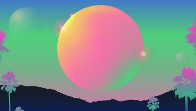
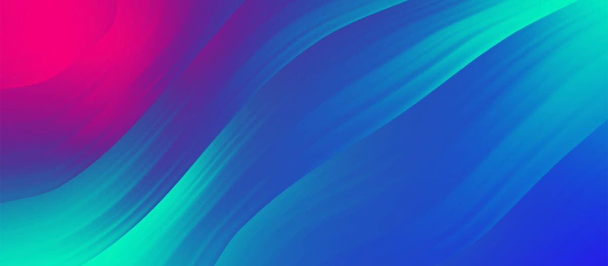
Gradients in motion design help capture our current emotional spectrum
Credit: Adobe Stock / StudioProX.
With all the inconsistency we have been experiencing, it’s not surprising one of the top Adobe Stock Creative Trends of the year is the use of gradients in motion. As parts of the world are opening up while other areas remain under lockdown, it can be challenging to nail down the scope of our collective experience from one moment to the next. Gradients reflect our blurred reality, colors and tones flowing seamlessly into one another, while maintaining the ability to uplift and energize. The popularity of multicolor gradients has skyrocketed in part because of this versatility, and we see them in everything from product packaging and logos to videos and commercials. They are even showing up as products themselves.
Gradients in motion not only capture our attention, but can be both dynamic and soothing, spirited yet calming, all at the same time. A gradient of colors can evoke a summer sunset or the cool rush of ocean waves, or pop with a neon burst and a sweep of dramatic movement. Using gradients in different, calculated ways allows creatives to showcase a spectrum of shifting emotions, and content creators and brands have taken notice. Creative teams are embracing gradients in major ad campaigns, identity design, and digital content.
Contents
A visual representation of revival and renewal
In the wake of this past year, people are reaching for connection and revitalization, which we are seeing reflected in different mediums. Creatives of all types are tapping into these complicated feelings, and have turned to gradients to express the scope of our fluctuating energy and mood.
Colorado writer Laura Bond wrote a post on social media about her complex feelings about her parents finally getting the vaccine. Gradients, for Bond, were the perfect way to pinpoint the acutely indescribable. “Energy is starting to shift,” she wrote. “It’s partly due to the waves and waves of relief being felt by fortunate Gen Xers and their parents, as the latter gets a second shot in the arm. Not sure I know the word to describe seeing my dad get his. It’s not a word. It’s an emotional gloaming, filled with gradient light.”
Major brands like Apple and Spotify have picked up on this too, and are using gradients to visually demonstrate emotions. In Spotify’s case, their “All the Moods” social media ad campaign plays with color in a bouncy display meant to express all the ways music can make us feel. Apple uses gradients to show off the rainbow of color options available for their products and to tap into the fun, happy feelings they want to inspire in their users. Both their “Introducing iPad Pro” and “Say hello to the new iMac” commercials make use of moving color gradients to highlight their new technology and summon a sense of energy, joy, and renewal.
“You see it everywhere,” says Nate Woodard, executive creative director at Unbridled Media, in a recent conversation with Adobe Stock about the gradient motion trend. “It’s hard to put a finger on what it is, culturally, that’s making it happen. After a year like last year, everyone just wants to be happy. Anything that’s going to bring more color and vibrance to their lives, that’s what people are drawn to.”
Dynamic energy for action and awe
While gradients can be used to produce a soothing effect, it’s not all mellow sunrises and cool summer tones. Their versatility makes them a perfect tool to display flashy, action-oriented movement that catches the eye. Advil’s “The Future is Here” advertisement uses a quick-moving wash of blues and violets to symbolize how their product blocks out pain in the human body. HBO Max’s “5 Day Countdown” spot uses a similar color scheme, mixing a rapidly rising tempo with gradient purples in a fast-paced countdown to their launch. This gradient is present in all their branding, including the HBO logo.
“A lot of brands aren’t just doing this with different grades of the same color like in a sunset or a smooth transition from yellow to red,” explains Woodard. “A lot of companies are branching out into contrasting colors. They can have that neon, that in-your-face effect. You can look at Audacy, for example, using it throughout their new branding as well. Swirls with different colors that you wouldn’t expect to go together, like orange and purple, but it works. It’s got that warmth to it, but it flies in the face of convention, which is what you’re supposed to do. It works because it’s visually interesting.”
A pop of gradient color like in this MAC Cosmetics ad can reinforce lively music and an upbeat reveal, or its rapid motion can draw the eye in fun, creative ways, as this Oral-B iO ad demonstrates. Movement in a spectrum of colors can amplify the action and infuses the motion with dynamic energy.
Incorporating these vibrant elements into visual media also reflects current collective experience — there is a fluidity inherent in this trend that speaks to the transformations we are all going through. Companies can both acknowledge this and convey a message of hope — and that they can keep it light in dark times — by using gradients in their marketing materials.
“I think people, especially now, appreciate companies and brands that aren’t too serious,” says Woodard. “Motion gradients offer a visual way for brands to express that they can be dynamic in how they think about themselves and their customers without coming off as cynical. I think it’s a visual way for brands to say, we get it. They can communicate it without having to say these things overtly.”
Evolving technology has paved the way to radiant, vibrant color
In the past, we couldn’t play with bold shifting colors in the same way we can now. Tech companies know this, and are using gradients to show off the capabilities of their products, like this 2021 LG OLED evo advertisement that uses an extraordinary array of neon elements to drop the viewer into a fully immersive experience of what they are offering.
Woodard agrees. “Now, there’s so much resolution and color in everything you use — your phone, your computer monitor, your television,” he says. “Everything is in 4K. Gradients let you play in that medium. If you’ve got this amazing iPhone screen, you want to see it work. You want to see it doing cool things. Simple color treatments aren’t as exciting.”
Technology also makes playing with color and motion more accessible to consumers. With user-friendly applications and motion templates, creatives at all levels have more opportunities to work and play with this popular trend. Motion graphics and editing software are more powerful than ever, so the possibilities are as endless as the gradients themselves.
Get into gradients in motion with this Adobe Stock curated video gallery.
Source : Adobe