As the role of design in healthcare shifts, Sanofi turns to design system thinking for solutions

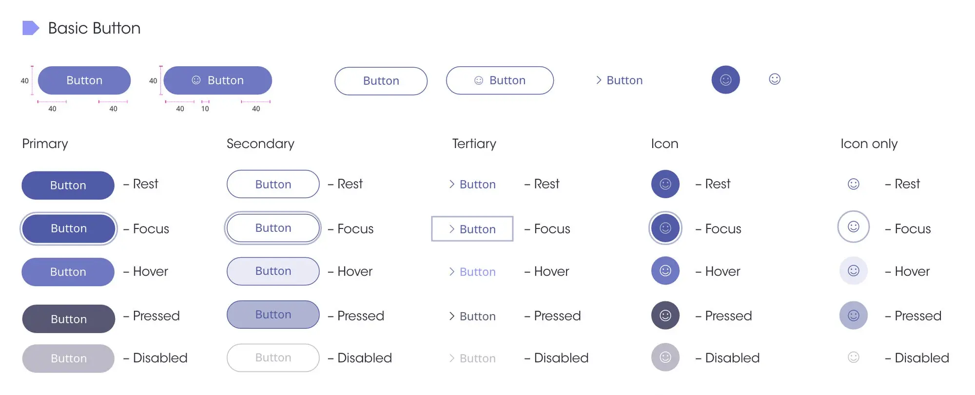
Sanofi’s European and U.S. teams utilize Coediting in Adobe XD and sharing via Creative Cloud products making moving between Creative Cloud and Microsoft applications seamless.
Healthcare is an incredibly regulated industry. Until very recently, a mix of security requirements and pre-existing mindsets has slowed down the adoption of agile processes and cloud-first solutions. The COVID-19 pandemic, however, has made us all more agile. It has also forced the healthcare industry to shift how it views design and the role of designers.
I’ve been lucky enough to be part of this change at Sanofi. It started in 2019, when I led the development of an external design system that reduced website design and development costs by 52% (no small feat at a leading global healthcare and life sciences company). Now I’ve joined our new global Customer Experience & Design team, and our focus is to take a similar approach, but have it facing inwards – to create an internal design system.
There were two main drivers that led to this initiative. First, our teams are globally distributed across time zones; and second, all of our internal applications have, generally, not been very consistent from an experience standpoint. Having an internal design system would allow us to design more efficiently and at scale, so that any internal team – as well as many different external partners – could use pre-designed components to quickly create experiences that are consistent with our best practices and established design styles. No more siloes or one-off production assignments, just a much more efficient process of creating internal tools and resources.
Launched in May 2020, this new design system, internally named Syntax, strives to enhance the employee experience by stitching together a common visual DNA across the tools we use on a daily basis. Syntax comprises the rules around our visual language; it is the style guide that bridges the gap between our internal applications.
When the pandemic hit, we were positioned to pivot
We started our transition to Adobe Creative Cloud’s cloud-based solutions well before the pandemic, addressing any security concerns and getting buy-in from the IT department at that time. We did this by working very closely with our Customer Success Management and Strategic Development Management partners at Adobe. Our close partnership with Adobe ensured our shift to these cloud-based solutions went smoothly.
As a global company, much of what we do already involves collaboration amongst colleagues and design partners scattered throughout different time zones. Although remote work was not a new concept for us, COVID-19 brought certain practical complications, like the impossibility of doing face-to-face user interviews and ideation sessions. Everything is now executed virtually, using tools like Zoom and the Adobe XD plugin Whiteboard for collective collaboration sessions. We needed to find ways to harmonize workflows wherever possible. To our advantage, many of our European and U.S. teams were already familiar with Adobe XD and Creative Cloud products, and this made building, implementing and scaling adoption of Syntax almost frictionless.
Two features that have been really effective for us, in making this happen, are Coediting in Adobe XD, and sharing via Creative Cloud Libraries (which makes moving between Creative Cloud apps seamless). Rather than forcing the adoption of these tools top-down, we took an approach of show, don’t tell. For example, I was recently working on the design for an email campaign with a colleague, and we were sharing PDFs back and forth. I packaged up all the assets in a library, sent them a link to coedit, and said “Try this.” They opened it up and went “Wow, this is amazing”, and just like that they were a convert.
The feedback we’ve gotten on Creative Cloud Libraries has been so positive that we’re now making plans to create a common set of assets through libraries that anyone can use for their deliverables, even outside of the core creative teams, such as for Microsoft applications.
The results so far
We’re only at the beginning of the development of our internal design system, but we’re already seeing very promising results. So far, it has allowed the teams to design and prototype much quicker than ever before. Although we have yet to measure exactly how many hours we have saved, the increased efficiency is palpable.
Having clear KPIs is very important. We treat our internal design system as a product itself with an associated Net Promoter Score (NPS), which measures the percentage of users that would recommend a product or service to others. This gives us a clear target, and helps us understand what’s useful, what’s not, or if users even know where to get the design system assets. NPS acts as a strong metric regarding the satisfaction and effectiveness of using the design system, allowing the system to grow based on user needs.
To measure the NPS, we send out a survey to all the stakeholders involved, including our external partner agencies who are using the design system. Our NPS is currently very positive – +83 out of +100. While this is a very positive result, our aim is to continue to grow this number over time and sustain existing users, while scaling efforts to include new users.
Practical tips for developing an internal design system
We’ve learned a few things along the way, that I hope will help you if you’re trying to implement an internal design system across your organization.
Get buy-in before you start. Teams and individuals are often open to looking at ways to be more efficient so we always make sure to communicate the ROI of our design system efforts – saving time and money goes a long way.
Start small (and don’t try to boil the ocean). We approached our internal design system as an MVP. Within eight weeks we had developed a basic UI kit and started using it immediately. As more users started adopting the system, we quickly iterated based on their needs and continued to educate and extend to more colleagues and partners. We did this by showing a better way of doing things, rather than simply criticizing the present way of working. As noted above, two examples were sending a link to help someone coedit in XD and (2) share assets via Creative Cloud Libraries.
Keep the team small, but dedicated. As a corollary to the previous point, avoid having too many contributors. This allows teams to make quick decisions and iterate based on user results. With our internal design system still in its infancy, right now we have just three people focused on maintaining it.
Make your design principles explicit. The design system won’t account for every need and use case. In order to never lose our true North, we authored a set of very clear design principles as well, and return back to them every time we have to make a decision. The design system and the principles go hand in hand.
Look for feedback. As you do with any good product, we’re constantly seeking feedback from our users. It’s important because we want them to remain invested. We continue to seek comprehensive feedback via interviews and surveys and iterate, evolve and grow the design system based on that feedback.
Having an internal design system to harmonize how we work, and tools that allow us to coedit and share resources has allowed us to be extremely agile – even during a global pandemic. Overall, this has positively influenced design thinking within Sanofi, and is ultimately leading to better outcomes across the organization, despite the challenging times.
Source : Adobe


