4 graphic design trends in 2021: Aesthetic responses to turmoil
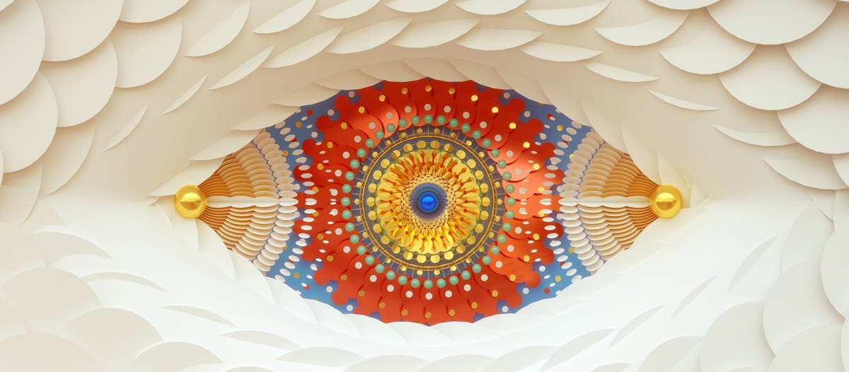
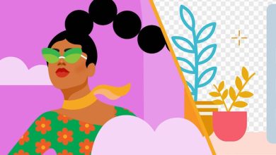
Image source: Adobe Stock / Avantform /Luke & Morgan Choice.
What better way to welcome 2021 than with an explosion of colorful, creative, inspiring design! Following on from our 2021 Visual Trends announcement, our second-annual Adobe Stock Design Trends outlook is here, and we could not be more excited to share it.
As a marketplace and continual source of creative inspiration, Adobe Stock is where artists showcase and sell photos, illustrations, vectors, design templates, motion graphics templates, and 3D artwork — and that gives us a powerful, unique insight into what is popular, what is on the way out, and what is rising to the surface next in contemporary visuals.
Our trend research methodology combines rigorous analysis and hours of hunting through Adobe Stock, plus sources like Behance, Pinterest, and Instagram. Our design and illustrations curators look at emerging patterns in technique, color, mood, and subject themes — analyze leading artists in the design templates community — and finally, review internal data on top downloads and search queries across all asset types to find rising motifs and themes.
Design reflects a response to what people are going through, and in 2020, most of us were going through a lot. Shea Molloy, vectors and illustrations lead at Adobe Stock, tells us that, when conducting design trend research this year, “we found it nearly impossible to divest our research from the events of the year” — like the COVID-19 pandemic and its wide-reaching effects on work, home life, politics, and every other facet of human interaction.
The outcome of all this digging and thinking is our 2021 forecast: Four design trends that are both visually striking, and deeply connected to how our lives have felt for the past several months. Let us take a deeper look at the 2021 Design Trends from Adobe Stock.
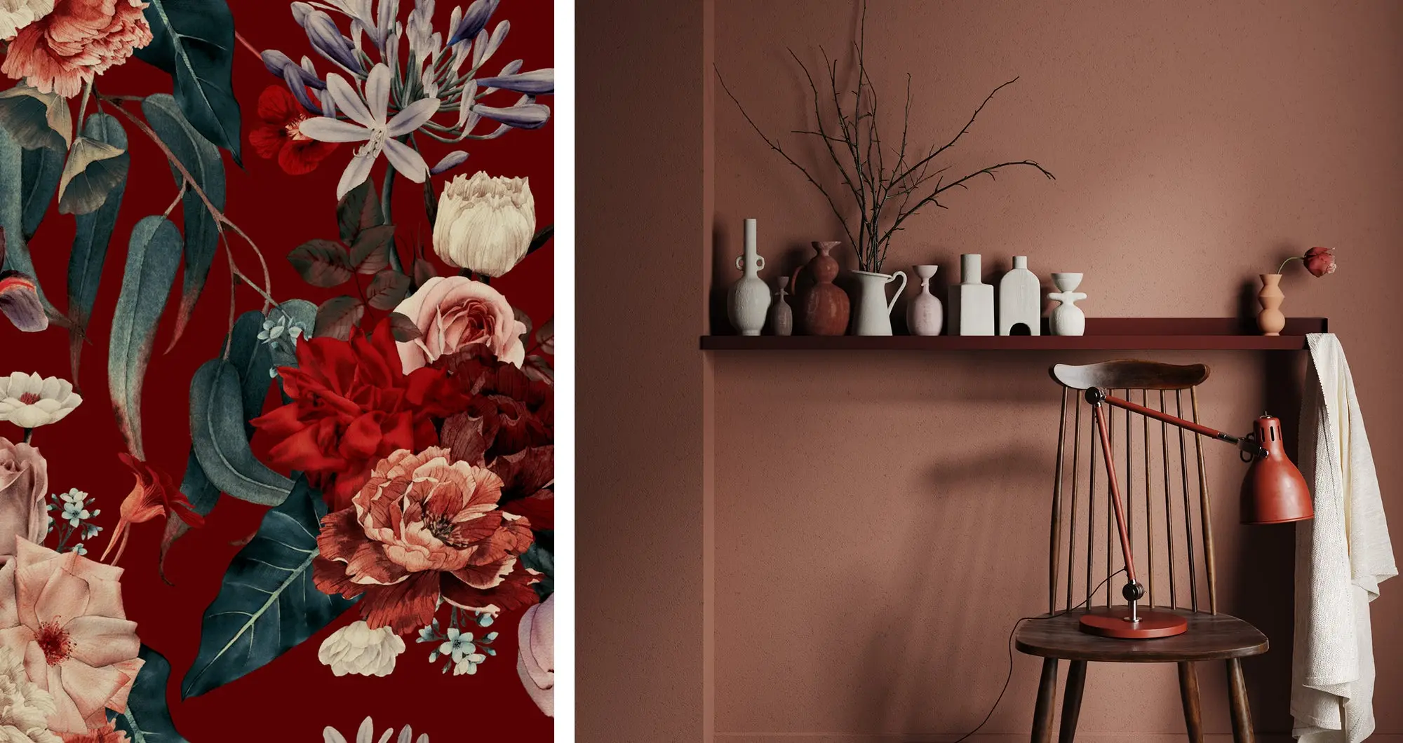
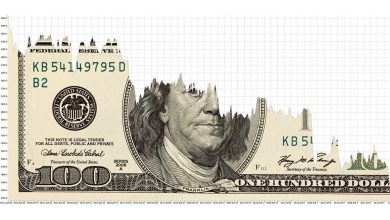
Image source: Left: Adobe Stock /ola-la. Right: Adobe Stock /artjafara.
Contents
1. Austere Romanticism
Austere Romanticism is a trend that encompasses Cottagecore, Dark Academia, Naturecore, and related aesthetic elevations of the antique and idealized nature. In these visuals, nostalgic representations of sophistication have a distinct primness, intertwined with a DIY spirit — people cultivating gardens, making their own bread, and other crafts around the home. The aesthetics of this are not urban or modern — they are rooted in throwback visuals, traditional typefaces, florals, and pastoral or rural elements.
That is not to say, however, that Austere Romanticism is a strictly “rural” aesthetic — far from it. It is a highbrow, idealized (you might say rose-tinted) vision of what it might be like to live in the country, on a farm, or in a cottage in the woods. This design trend speaks to a costume-drama sensibility of rural simplicity and beauty, where highly educated sophisticates lounge elegantly in vintage lace, contemplating the mysteries of life amid stacks of illuminated, leather-bound tomes in an Instagram-ready library or conservatory filled with thriving plants.
Beneath the dreaminess and fantasy of such visions lies a strong collective desire to step away from the physical dangers and the torrent of information and news that accompanies modern life, and retreat to a fictional, simpler place and time. While the COVID-19 pandemic ravaged our communities, crowded city life felt increasingly undesirable and unsafe. A companion in many ways to our 2021 visual trend, A Breath of Fresh Air , the acceleration of the Austere Romanticism design trend communicates a vision of nature as a healthy place to escape and a source of freedom and inspiration.
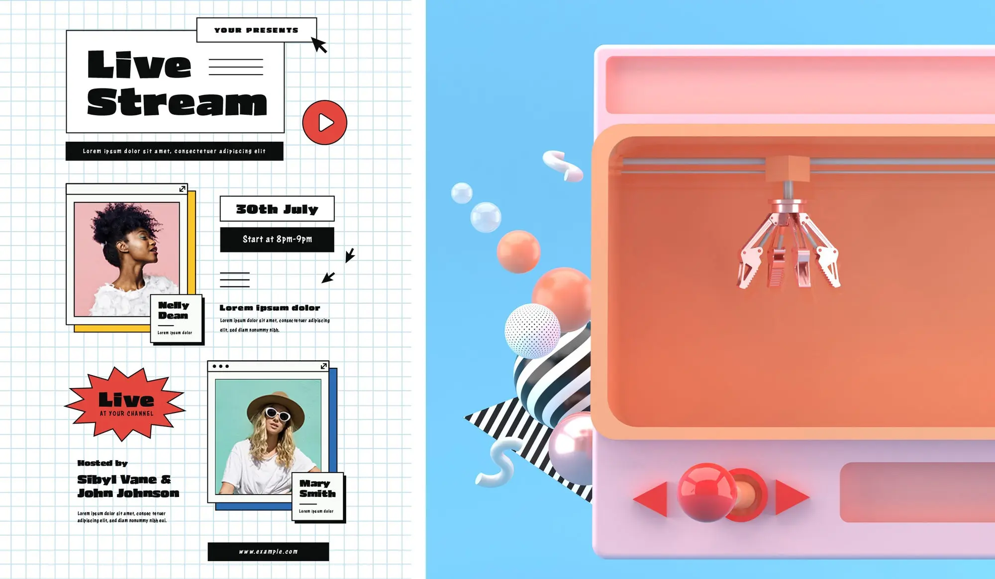
Image source: Left: Adobe Stock / vynetta. Right: Adobe Stock / Garfieldbigberm.
2. Vintage Vaporwave
A direct descendent of last year’s Modern Gothic design trend and Neon Glow motion trend, Vintage Vaporwave explores new frontiers via a visual language full of early-Internet references and aesthetic tropes of the 1990’s.
The look of this trend is heavily reliant on the speed and ubiquity of social media, and the evolution of new technology that people are now using constantly — for example, stickers in social media apps, and companion apps that help you create quick layouts for social media stories. The concept of stickers extends to augmented reality, too, with colorful, cartoony graphic elements overlaying the world around us, through a screen.
The color palettes in particular help differentiate this trend from aesthetics that came before it. “It’s a little softer — more Y2K, less cyberpunk,” says Molloy, noting the prevalence of cheery pastels paired with neutral shades.
Vintage Vaporwave also has a sense of humor, with tongue in cheek, playful graphics, and nods to old school, obsolete technologies mixed with offline, analog elements — think pixel art with cut paper shapes, or heavily outlined digital stickers against heavy shadows. Games, especially mobile games, are a strong influence bringing this trend into the mainstream. The massively popular game Among Us is a perfect example of the winking mashup of old-school graphics and music, lighthearted and mischievous sense of humor, and faux-high-tech setting — all potentially rich Vintage Vaporwave veins to explore.
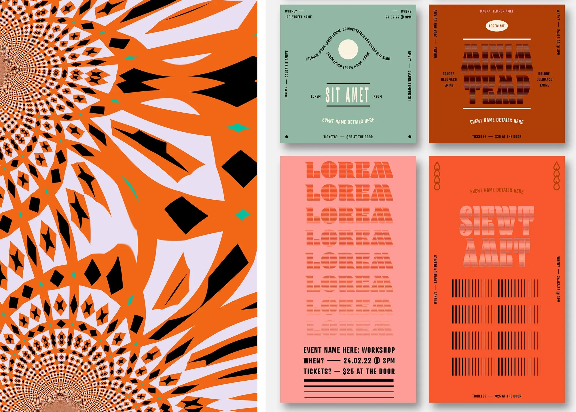
Image source: Left: Adobe Stock / vladchemera. Right: Adobe Stock / Wavebreak Media.
3. Psych Out
The funky, loud, and escapist Psych Out design trend started as a response to minimalism, but in a new way.
“Last year’s Semi-Surreal design trend is very much related to this — it was very futuristic, fun, and playful. And Psych Out is too — but it’s a lot heavier, weirder, and a bit dark,” says Molloy.
Thought it strongly references the psychedelic 1970s and Art Nouveau, this design trend is not just a nostalgia trip. Instead, it is a heady blend of old and new.
“I think it partly originates in the rise of the latest wave of psychedelic music and Dark Americana,” says Molloy. “There are a lot of bands that develop these styles that interpret an older sound in a new way.” One example, the fancifully named band King Gizzard and the Lizard Wizard, rocketed to popularity in recent years with a blend of jazz, hard rock, psychedelia, and folk sounds. Their music (like much of Psych Out design) is heavily influenced by the 1970’s, combined with modern subject matter with lyrical references to cyborgs, automation, and climate change. Gen Z also had a passionate 70’s moment when Fleetwood Mac surged in the pop culture spotlight thanks to a viral TikTok post.
Back to visual design, and speaking of climate change, Molloy says she has seen many examples of work that references climate and sustainability within the Psych Out trend. This reaches into product design, she points out — “You’re seeing a lot of designers or small businesses creating new products with bold, unique identities that emphasize environmentally-friendly missions — locally sourced wine or naturally-flavored CBD drinks, for example.”
In illustration, Psych Out manifests with a lot of what Molloy calls “far out” imagery — figures floating, flying, or traveling through fantasy scenes or outer space. In an era defined by long months of sheltering in place due to COVID-19, those colorful, expressive fantasy travels take on tantalizing new dimensions.
Overall, people are using this style of design to share educational and values-driven messages, imbuing them with energetic color, weightier nostalgic elements, curvilinear forms, and decorative, funky fonts that grab attention and hold on tight.
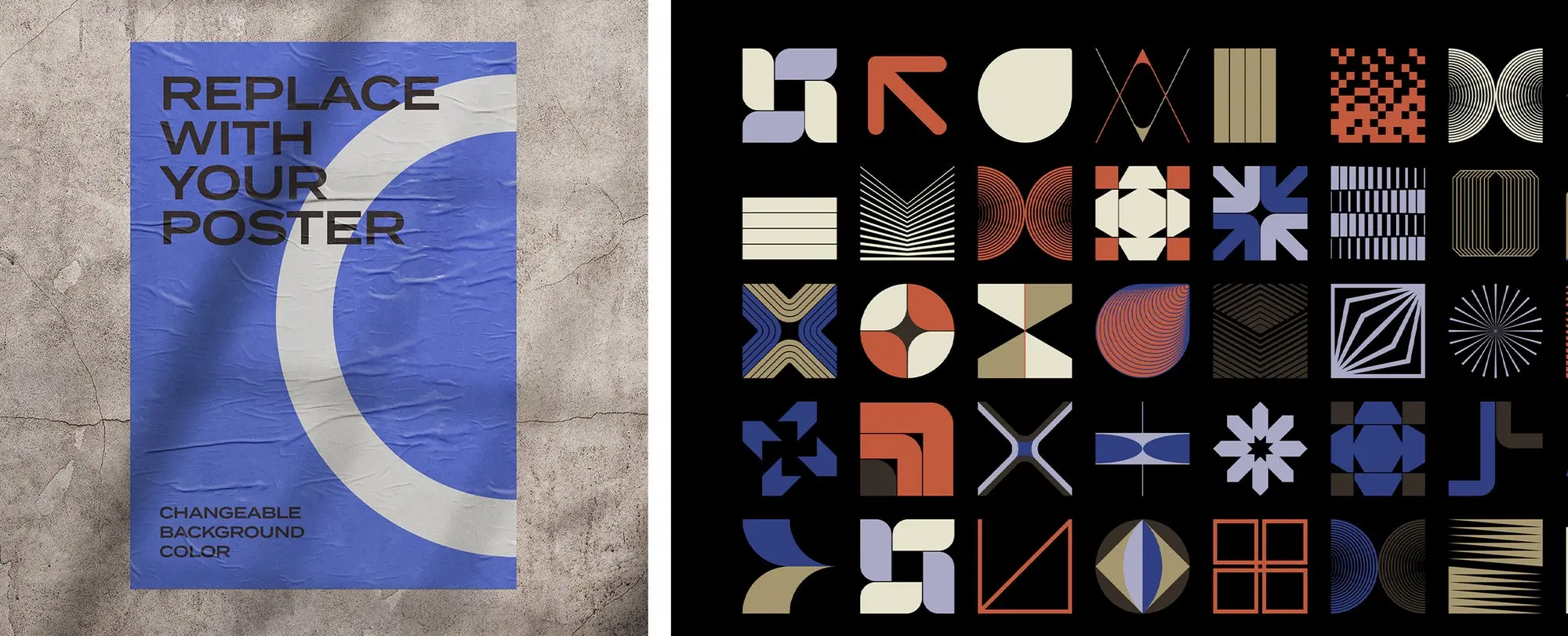
Image source: Left: Adobe Stock / x10. Right: Adobe Stock / Norm Form.
4. Back to Bauhaus
One of the first and clearest design trends we identified this year, Back to Bauhaus expresses a strong return to interest in craft — specifically, the craft of graphic design. Here, we see clean, formal compositions, sharp, dramatic shadows, and geometric shapes in digital and 3D design.
The Bauhaus was a German school that taught a generation of designers and, from 1919 to 1933, combined design, architecture, crafts, and the fine arts.
“The Bauhaus was perceived socially to be pretty political in its ethos and practice,” explains Molloy. “These designers focused on craft in a response to the industrialization of their work. There was a powerful focus on learning to make things — learning how to build things yourself and own your creative expression.” The school was ultimately closed rather than assent to the demands of the Nazi regime (such as the removal of Jewish instructors).
Timing may have had a lot to do with the rise of this design trend. “I think this trend specifically came from so many designers getting really excited about the 100th anniversary of the Bauhaus school, which was in 2019,” says Molloy. “The trend made its way through media likely because many artists found inspiration in the different retrospectives. We saw many organizations creating educational pieces, materials, or events about the Bauhaus, which extended through the past year.”
This widespread celebration throughout the design community led to an explosion of new work and voluminous new output builds on the far-reaching influence of Bauhaus design. That foundation is evident in the strong compositions, formal harmonies between design elements, and vibrant primary colors that pop up throughout the Back to Bauhaus trend. Innovative use of shape and perspective expressed with 3D elements brings these designs into the future.
Explore all the 2021 Adobe Stock Creative Trends.
Source : Adobe